Using images to create Icons and Buttons
Previously, we talked about creating icons with CSS Sprites. You'll need this image (Source: http://www.lighttek.com/icon/index.htm) for icon part of the exercise and this image for the button part.
You will also need this original file, which will eventually look like this completed file.
CSS Sprites
A sprite is a portion of an image used as a background. This allows multiple backgrounds to be in a single image. This is advantageous for several reasons:
- Fewer network requests
- Usually a smaller overall size
- Changing a style requires updating 1 file, not many
Making the Button
First we will start with styling the anchor tag so it looks correct. This is just the basics, and should be nothing new.
a.button {
color: #444;
text-decoration: none;
font: normal 12px arial, sans-serif;
float: left;
}
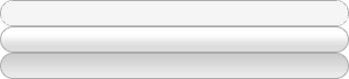
Sliding Doors
First we will make use of the sliding doors technique; where we take two images or in this case, two parts of the same image, as backgrounds. One part of the image is used for the left side, the other for the right. This allows the image to adjust to the size of the text.
So now we need to add the background image to the anchor tad. This will give us the right side of the sliding door.
a.button {
background: url(buttons.png) no-repeat top right;
/* all else same */
}
If you perform a test you'll see the text runs into the background image. That just won't do. So we need to create an offset for the text.
a.button {
padding-right: 18px;
/* all else same */
}
The span will help us vertically center the text. All the rules work together to allow this to happen.
a.button span {
padding: 5px 0px 5px 18px;
line-height: 14px;
display: block;
}
So far the right side of the button has been shown. Now we want to show the left side of the button. So we will use the left part of the background image.
a.button span {
background: transparent url(buttons.png) no-repeat scroll top left;
/* all else same */
}
This finishes out the button. We use one image for the regular state.
Adding a Hover and Active State
Since we use the one image for the left and right sides of the button, why not use it for the different states of the button. Remember, you only need to apply the changes to the rules, not all of the rules for your pseudo-selectors.
a.button:hover {
background-position: right -24px;
}
In this case, since our sprite source image has all three states in it, we need to position the new image. Since it is not at the top, we move the height of the area down, but in a negative positron. In this case -24 pixels. The "active" state is at the bottom of the image, so we use the built in key-word "bottom".
a.button:active {
background-position: right bottom;
outline: none; /* hide dotted outline in Firefox */
}
The outline rule is used to hide the dots that Firefox puts around active elements.
Of course, we need to also define the hover and active states for the span.
a.button:hover span {
background-position: left -24px;
}
a.button:active span {
background-position: left bottom;
outline: none;
}
Remember to move the position to the left side of the image.
Final Tweaks
Additionally, you can tweak the active state. In this final example, I've adjusted the padding, to drop the text by a pixel. This gives the allusion of the button being pressed in.
a.button:active span {
background-position: left bottom;
outline: none;
padding: 6px 0px 4px 18px;
color: #000000;
}
Icons
Icons help provide a visual clue about the function of a button. By adding them they provide a message to the user. They are not always needed however.
Icons should also be from the same "family"; i.e. they should follow a similar theme, metal, shiny, cartoony, etc. Mixing their styles is hard on the eyes visually, and detracts from the list.
If you look at the code, each button, is given the class button, but is also given another class. We will use this to define the background image. We needed to define the inner area. A second span would not have rendered correctly according to CSS rules, as it would have taken on the a.button span attribute twice. I used the <b> tag, as it is small.
First we will make sure the b tag is not doing anything "bad" such as bolding it if we didn't want it to be bolded, or ensuring it was bolded if we did.
.button b {
font-weight: normal;
}
Now we will add the appropriate background image (part) to the button to make an icon.
I am going to pick home first. I also notice that it is the first icon at the top, so it should be easy to identify.
a.home b {
background: url(icons.png) no-repeat left top;
}
If we try this however, we see the image is behind the text, so we need to add a left-padding. This way the image is shown, but the text doesn't cover it. In this case 22px was enough, although more or less may be needed depending upon the width of the icons. Likewise, while the icon was only 20 pixels wide, the extra 2 pixels was to push the text a little bit from the image so to not crowd it, and make the text difficult to see.
a.home b {
background: url(icons.png) no-repeat left top;
padding-left: 22px;
}
Now that home is done, we just need to move on to the other classes of buttons. We will not be able to use "top" of course. So we offset by a pixel position. One could randomly guess, until they get the right icon, or they could use the ruler function in photoshop.
a.home b {
background: url(icons.png) no-repeat left -105px;
padding-left: 22px;
}
Repeat this for all of the icons needed for your buttons.