Web Typography
Typography is the craft, art, and science of typesetting, type design, and modifying type glyphs. Type glyphs (characters) are created and modified using a variety of illustration techniques. Details involved in the arrangement of type include the selection of fonts, point size, line length, leading (inter-linear spacing), letter spacing, and kerning. - Wikipedia
While, in the web realm, are use of type is limited, it is not without the ability to be controlled. How we use type, will directly effect how readably a page is, or isn't. Consider the following two screen shots.
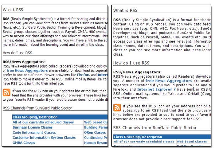
The two screen shots are of the same page. The screen on the rights has one typography property modified, and that lead to a huge increase in readability. I added a letter-spacing of 1px to keep the letters from being to closer to one another.
Readability should be of the foremost importance. Design of the site/page layout should be a close second.
Common CSS attributes to change to enhance readability:
- font-size
- letter-spacing
- line-height
- font-family (within "web safe" fonts)
- margin/padding of both text, and surrounding elements
See how adjusting the above CSS rules effects readability.
Titles, Page headings and sub-headings
How titles, headings, and sub headings are displayed, can enhance both the readability and the design of a site. Especially if working with a minimalist design where the type is a large part of the design.
With this type of text, you want to ensure that it stands out, and grabs attention. While it needs to contrast the text around it, so the user knows it is more important, it should also be close enough to the text, so they look like they go together. This is more true in sub headers (h2, h3, etc.)
Titles, while not a tag, can often allow for larger than normal text. The title can be made up of several tags, ids, classes, or combinations of those to get the desired effect. eg <div id="header"><h1>title</h1></div> or <h1 id="title">my title</h1>
Other References
- 15 Excellent Examples of Web Type
- CSS Typography - Digital Web
- Web Typography
- 5 Principles And Ideas Of Setting Type On The Web - Smashing Magazine